JavaScript seems to be disabled in your browser. For the best experience on our site, be sure to turn on Javascript in your browser.
Magazine Subscriptions
Pay Monthly Magazine Subscriptions
The People's Friend
My Weekly
Beano
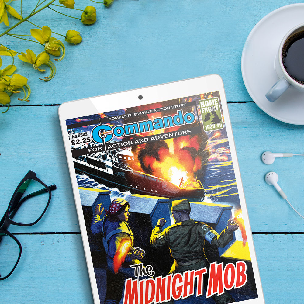
Commando
The People's Friend Pocket Novel
My Weekly Pocket Novel
Women's Magazines
The People's Friend Special
My Weekly Special
Lifestyle Magazines
The Scots Magazine
This England
Sports Magazines
bunkered
British Comics
Kids & Teens
110% Gaming
Puzzler Kids Collection
Junior Puzzles
Digital Subscriptions
Puzzle Magazine Subscriptions
Mixed Puzzles
Puzzler
Puzzler Collection
Pocket Puzzler Collection
Best Puzzler Ever
Puzzler Special
Q Puzzle Compendium
Q Junior Puzzles
Crossword
Pocket Crosswords
Tea-Break Crosswords
Q Coffee-Break Crosswords
Q Pocket Crosswords Collection
Nonogram
Hanjie
Super Hanjie
Wordsearch
Pocket Wordsearch
Mammoth Family Wordsearch
Q Word Search
Q Pocket Wordsearch Collection
Arroword
Arrowords
Q Pocket Arrowords Collection
Codeword
Codewords
Q Code Words
Q Pocket Codewords Collection
Kriss Kross
Q Kriss Kross
Puzzles for Kids
Sudoku
Sudoku Puzzles
Sudoku Puzzles Collection
Killer Sudoku
Beyond Sudoku
Extreme Sudoku
Logic
Logic Problems
Suguru
Kakuro
Pocket-sized Puzzles
Our latest books & bookazines
Beano & The Dandy Specials
Beano Summer Activity Special 2024
The Dandy Summer Special 2024
Beano Presents: The Bash Street Kids
Beano Comic Ultimate Summer Pack
Beano & Dandy Summer Special Pack 2024
Exclusive Gifting Packs
Beano & The Dandy Summer Special Pack 2024
Beano Ultimate Summer Pack
110% Gaming Presents: Roblox Pack
110% Gaming Presents: Pokémon Pack
Kids Activity Books & Bookazines
110% Gaming Presents: Ultimate Pokémon Legends
Gaming Guides featuring Roblox & Pokémon
110% Gaming Presents: The 100 Games You Must Play
110% Gaming Presents - Roblox Blockbusters
Graphic Novels
Commando Presents: Codename Warlord
Travel Guides & Inspiration
Ultimate Scottish Road Trips
Historic Homes of England
Expert Golf Guides
Play Your Best Golf
Sign up to Newsletter
ANNUALS
GARDEN
MAGAZINE SUBSCRIPTIONS
SCOTTISH GIFTS
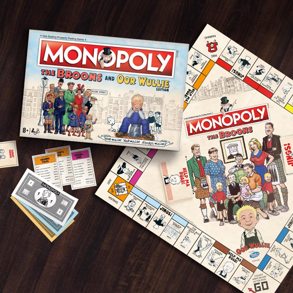
The Broons & Oor Wullie
BOOKS
Kids & Teens Subscriptions